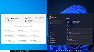
Windows 11 does not have only visual changes but also a peek to its Settings app. It looks that Microsoft has given more attention to this option of the newly designed OS to provide better control for the users over their systems.
We are here to do a brief study on the newly Windows 11 Settings app and see how it is different from earlier windows versions, Windows 10 especially and also try to find what the efforts the company made the settings app to make it aesthetically better.
Differences in Windows 11 Settings app and Windows 10 Settings
Overall Settings Design
Windows 10 settings app’s homepage had a lot free space on large screens that give it a looks weird. Microsoft is trying to give better design in Windows 11 Settings app by big headers, text and improved navigation.
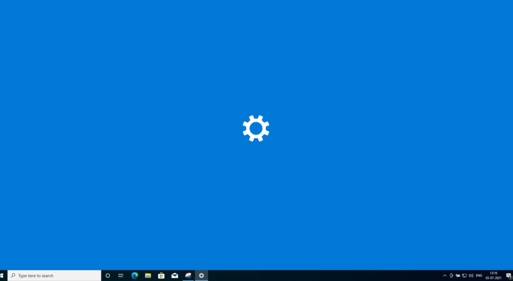

First area you come up in the newly Windows 11 settings app is the System page. The splash screen will now have a new settings logo and no dashboard is visible in it – see the screenshots below.
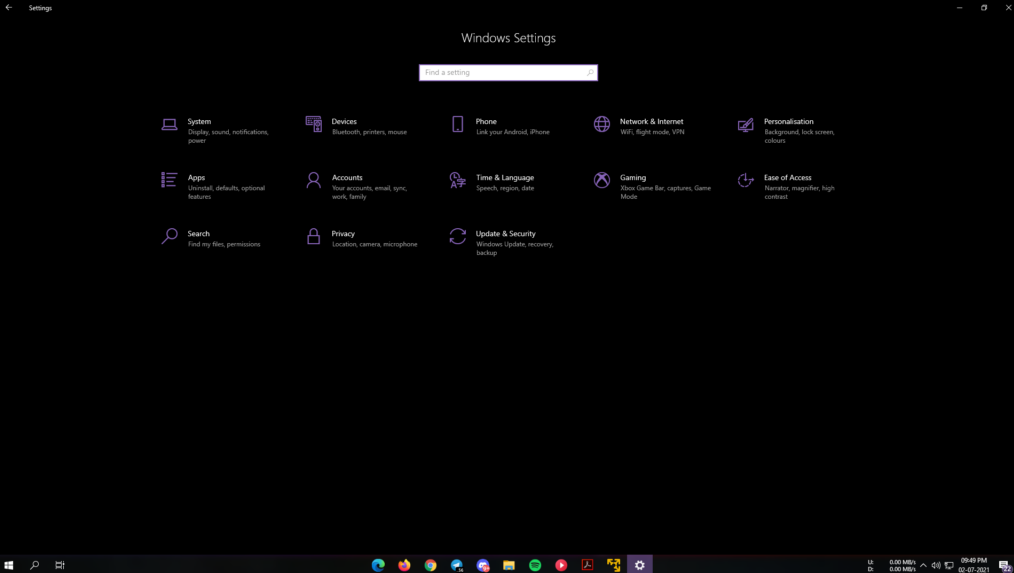
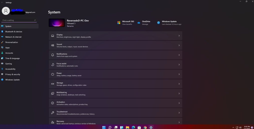
Coming to the visuals, in addition to a new look to it, you will see a descriptive thumbnail on every page that tells you about the type of pages. As for example, personalization page shows a display and system page has a tablet next to the PC name.
Better Settings Navigation
Another changes made to the Windows 11 Settings is the navigation redesign. Microsoft gives it a look similar to what we see on Microsoft Edge. You will see a sidebar on the left with all major categories like Systems, Apps, Gaming, Accounts and etc. These sidebar options will be visible on any pages you are on.
You can easily switch between primary categories pages without a need of starting over. The pages and sub-pages will appear in header and thus it will easier for you to know about the page you are browsing and where it is located. These will definitely save your one or two clicks on every page.

Better implemented Devices page
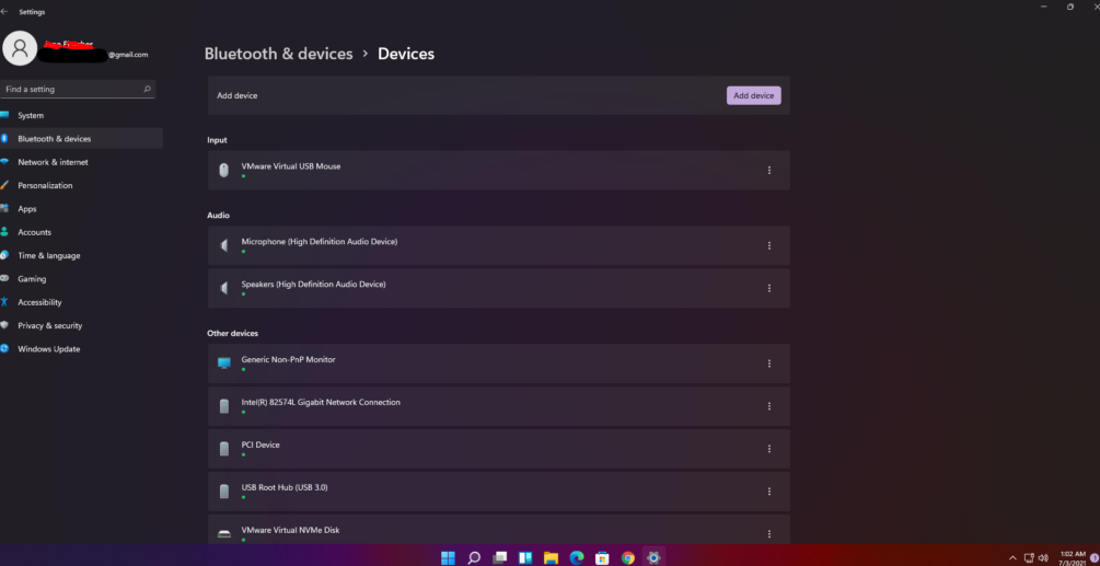
Bluetooth & Devices page is one of the most commonly visited places in Windows Settings app. In the newly Windows version, this option also got a makeover. Now, you will see big and good-looking thumbnails for audio devices connected to the PC and more details look to the devices connected to it.
Also, the presentation is making better by displaying little green dots for all connected and active devices. Moreover, Your Phone app settings are now placed within this Bluetooth & Devices page during the reorganization.
Better Sound Control
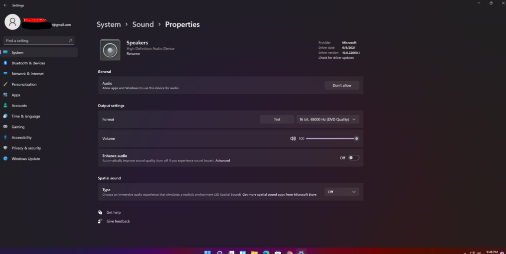
System sound properties inside the Settings app will now show the sound settings for all connected sound hardware such as headphones, speakers. All the hardware-tied options are incorporated in the settings app and thus you will not have to pick sound quality for each audio device individually.
Refined Personalization Settings
There are little previews in the new Windows 11 settings’ personalization page for selected theme and color accent. Also, there is different page view in Windows 11 Settings app in contrast with the Windows 10’s settings that you can understand from the image below.

Battery Stats on Laptop and tablets
Windows 11 battery does not exist just a way it was in Windows 10. You can now see per-hour battery consumption of your device, alongside the screen on and screen off times. Also, you can know what time the PC was last plugged in and how much battery percentage was at a particular hour.

Co-existence of Control Panel and Settings
Earlier, when Microsoft introduced Settings app with Windows 8 release, both of the users got confused with two separate apps namely Control Panel and Settings app for system management. Settings app however has been gained spotlight and ballooning in size with each windows update. Now, the scene is that the Control Panel that holds core system settings is within the Windows 11 Settings app.

